A stalled shared-studio brand, rebuilt into a converting membership site.
Workshop had the brand — what it needed was a site that matched it. We redesigned the frontend around colour psychology and a simplified sign-up flow, then kept iterating the MVP in Agile phases to lift lead generation and membership conversions.


From landing page to booked membership.
A great brand,
a site that undersold it.
Workshop had a strong identity and a genuinely different offer — shared studio space built for London’s creative freelancers, not another anonymous co-working chain. What it didn’t have was a website that got that across.
The site needed to differentiate Workshop from every other flexible-desk provider in London, and turn browsing into booked tours and paid memberships — without a redesign that took months.
Four pillars behind Workshop.
We rebuilt Workshop’s frontend around how its audience actually decides, then kept refining it in Agile sprints rather than shipping once and walking away.
Colour-led visual design
A contemporary frontend using colour psychology deliberately — steering the eye toward the messages and buttons that actually move a visitor toward booking.
Simplified sign-up journey
UX refinements stripped friction out of the registration and enquiry flow, so interest turned into a booked tour more often.
Built for the creative audience
Design decisions were made for Workshop’s actual audience — working creatives — not a generic co-working template reused from elsewhere.
Agile MVP iteration
Rather than one big launch, we shipped an MVP and kept iterating against real usage — the site keeps evolving as Workshop does.
Browsing turned into booked tours.
Still iterating,
still converting.
Workshop’s site now does the job its brand always deserved — communicating what makes it different and moving visitors toward a membership, not just a bounce.
It was built to keep evolving. The Agile approach means the MVP keeps getting refined against how members actually use it, not frozen at launch.
A frontend that finally reflects the Workshop brand
Colour psychology applied deliberately, not decoratively
A simplified sign-up journey from visit to booked tour
Design built around working creatives, not a generic template
An MVP that keeps iterating against real usage
A site that differentiates Workshop in a crowded market
Still shipping, sprint by sprint.
Frontend rebuild & UX redesign
Design phase
MVP launch
Initial release
Agile iteration
Ongoing
What Workshop is built with.
A deliberately unexciting stack — chosen because it holds up in production, not because it was new.
 WordPress
 Advanced Custom Fields
 JavaScript
 HTML5
I came to Workshop and I felt straight away that this was the place for me. You can come whenever’s convenient, interesting things are always happening, and it’s fun to have people around that you can get to know, and consult and learn from.
Other websites
we've shipped.
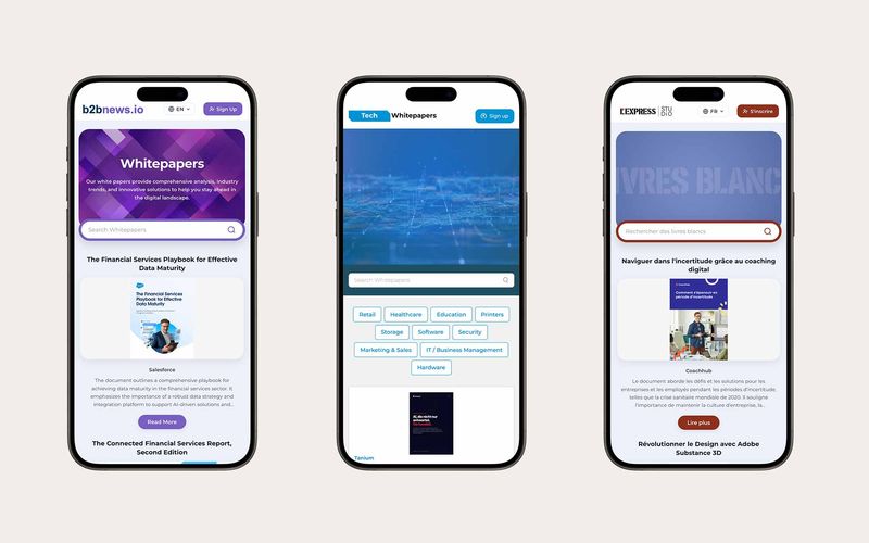
One whitepaper platform, styled for every client.
A template-driven, multilingual whitepaper platform for Rethink Demand's clients — brandable in minutes, synced to Hermes, and built to capture and track every lead.
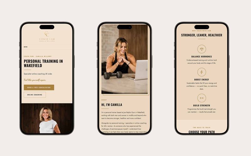
A brand-led website refresh, live in a week.
A brand-led, multi-page, responsive website refresh for Wakefield personal trainer Camilla Willows (Coach Cam) — designed and built in one week using Claude for speed.
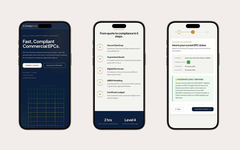
An EPC risk calculator that quotes in minutes.
Our own product for commercial EPCs: an online EPC Risk Calculator that checks a building against the national register, shows its MEES risk instantly, and turns it into a fixed quote for a Level 3 or 4 assessment in under two hours.
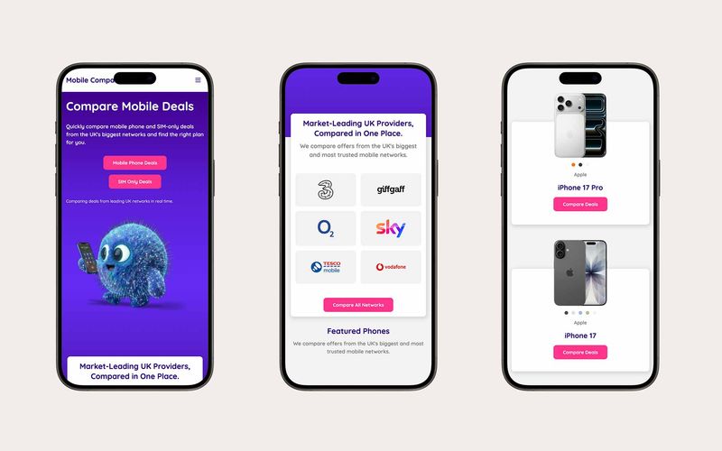
PPC landing pages for a comparison brand, live in two days.
A set of mobile deal comparison landing pages built to power a Google Ads campaign — designed in Figma, built in Figma Make and live in two days, driving paid traffic while building brand on the client's own domain.
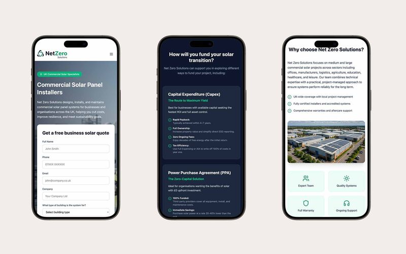
A commercial solar website, built end to end with AI.
A commercial solar website built end to end with AI: vibe-coded directly in Figma Make with every image generated in Google Flow, delivered in one week on a tight budget.
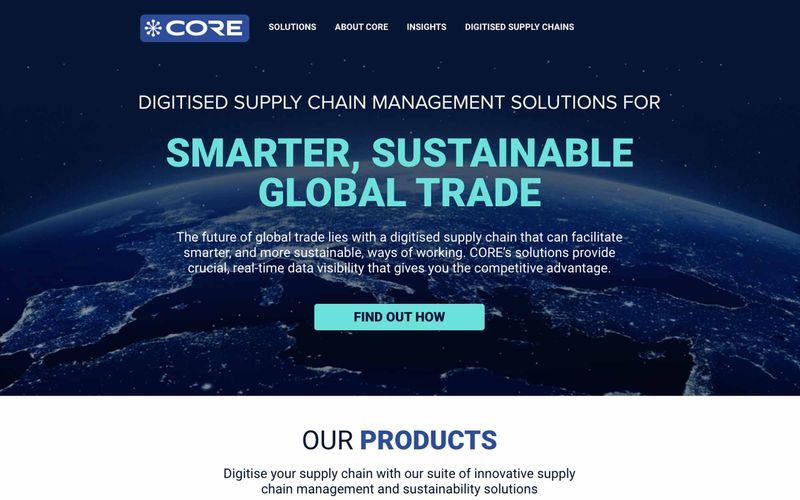
A bespoke WordPress rebuild for global supply chain.
Core is a global supply chain management company that needed a new bespoke WordPress build to improve user experience across its products and services.
Questions, answered straight.
Have an outcome in mind?
We'll help you
ship it.
- You're building a data product and need a team that can deliver.
- You want to get AI-ready — pragmatically, not theoretically.
- Your reporting is a mess and you need a real platform underneath it.