Campaign-ready landing pages, live in two days.
Comparison Systems needed landing pages for a Google Ads campaign — and needed them before the campaign went live. We designed Mobile Compare in Figma and built it out in Figma Make, shipping a bright, conversion-focused mobile deals comparison site in two days. It drives paid traffic into their white-label comparison platform while building brand awareness and search authority on a domain of its own.


Bright, bold and built to convert.
The campaign had a start date.
The pages didn't exist yet.
Comparison Systems already run Fibre Compare, their main broadband comparison service. For mobile, they wanted to push Google Ads traffic to a white-label comparison platform — but sending paid clicks straight to a white-label page does nothing for your own brand, and builds no authority on a domain you own.
So they needed a destination of their own: a set of landing pages good enough to convert paid traffic, on-brand enough to build awareness, and structured to start earning rankings on the Mobile Compare domain. The catch was the clock — the campaign was booked, so the pages had to be designed, built and live in days, not weeks.
Four pillars behind Mobile Compare.
A two-day turnaround changes how you work. We designed in Figma and built in Figma Make, cutting the handoff between design and build almost entirely — and kept every decision pointed at one job: converting paid clicks. Four pillars carry it.
Designed in Figma
We designed the pages in Figma first — a bold violet-and-pink palette, a friendly mascot and big, unmissable CTAs. Designing up front meant the client could see and sign off the whole look in hours rather than waiting on a staging build.
Built with Figma Make
The signed-off design went straight into Figma Make to generate the production pages, collapsing the usual design-to-development handoff. That's the single biggest reason a full landing-page set went live in two days.
Built for paid traffic
Every element earns its place for a PPC visitor: split Mobile Phone Deals and SIM Only routes above the fold, recognisable network logos for instant trust, featured handsets, and a three-step explainer — all funnelling to the comparison click-through.
A domain of their own
Because the pages live on the client's own Mobile Compare domain — not the white-label platform — the campaign builds brand awareness and search authority they keep. Supporting content and FAQs give the domain something to rank for beyond the ads.
What the build delivered.
Live before
the campaign was.
Mobile Compare gave Comparison Systems somewhere of their own to send Google Ads traffic — a bright, credible comparison brand that converts the click while building awareness and search authority on their own domain, alongside Fibre Compare.
Small project, tight deadline, no drama. Designing in Figma and building in Figma Make meant the whole set was designed, approved and live in two days.
Campaign-ready landing pages live in two days
A distinct Mobile Compare brand, separate from the white-label platform
Paid traffic landing on a domain the client owns and builds equity in
Mobile-first pages, matched to where PPC traffic actually comes from
Trust signals up front — the UK networks users already recognise
Supporting content and FAQs to start earning organic rankings
Designed, built and live in two days.
Design in Figma
Brand & page designs, signed off
Build in Figma Make
Design straight to production pages
Launch
Live for the campaign
What Mobile Compare is built with.
Designed in Figma, generated as clean HTML5 through Figma Make, and hosted on AWS — a deliberately light stack for pages that had to ship in two days and load fast for paid traffic.
 AWS
AWS HTML5
HTML5 Figma
FigmaWe’re most impressed by their creative skills, project management, and communication.Read more client stories
Other websites we've shipped.
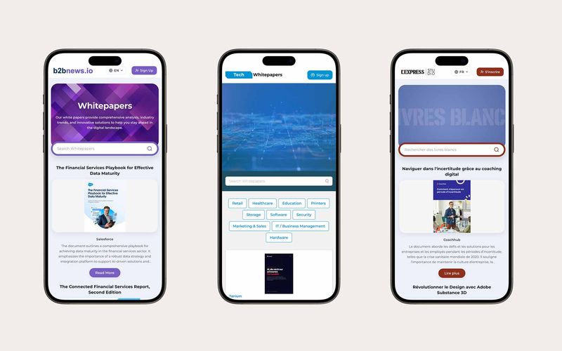
One whitepaper platform, styled for every client.
A template-driven, multilingual whitepaper platform for Rethink Demand's clients — brandable in minutes, synced to Hermes, and built to capture and track every lead.
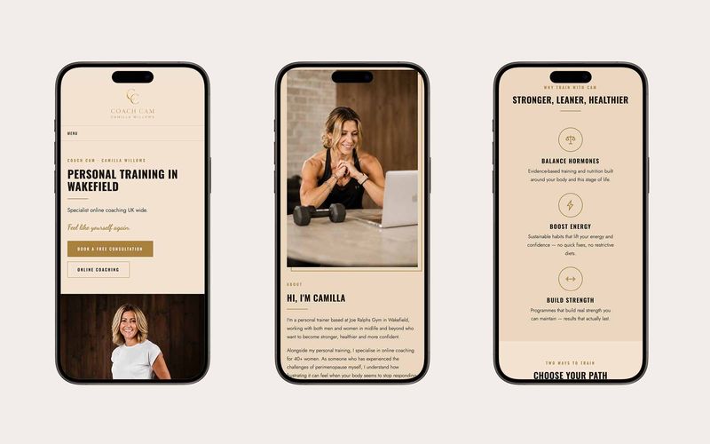
A brand-led website refresh, live in a week.
A brand-led, multi-page, responsive website refresh for Wakefield personal trainer Camilla Willows (Coach Cam) — designed and built in one week using Claude for speed.

An EPC risk calculator that quotes in minutes.
Our own product for commercial EPCs: an online EPC Risk Calculator that checks a building against the national register, shows its MEES risk instantly, and turns it into a fixed quote for a Level 3 or 4 assessment in under two hours.
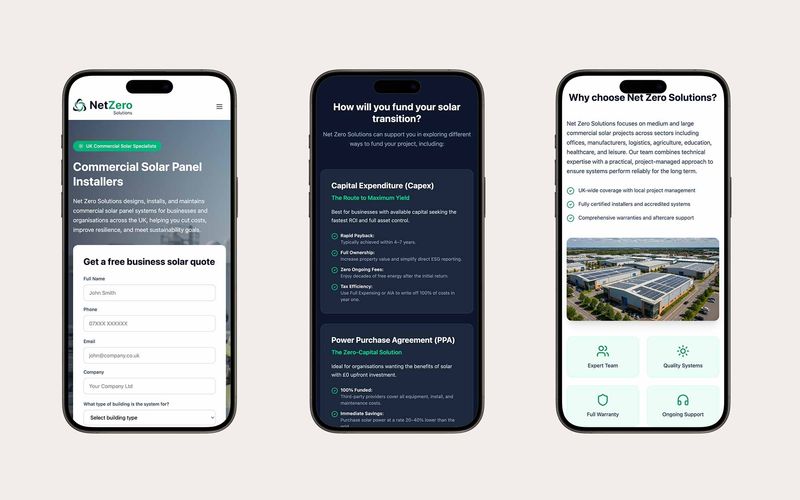
A commercial solar website, built end to end with AI.
A commercial solar website built end to end with AI: vibe-coded directly in Figma Make with every image generated in Google Flow, delivered in one week on a tight budget.
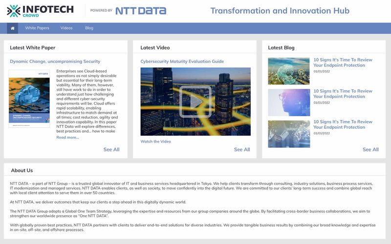
A dynamic content platform, powered by validated data.
An online content syndication platform powered by machine learning and validated B2B data pulled from all over the world.
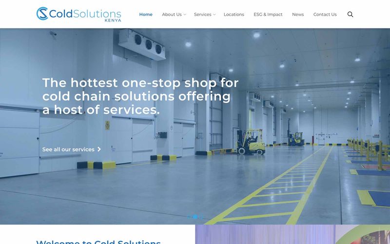
Brand and website for East Africa's cold chain leader.
Cold Solutions is East Africa's leading temperature-controlled warehouse and logistics service provider.
Questions, answered straight.
Have an outcome in mind?
We'll help you
ship it.
- You're building a data product and need a team that can deliver.
- You want to get AI-ready — pragmatically, not theoretically.
- Your reporting is a mess and you need a real platform underneath it.