Client
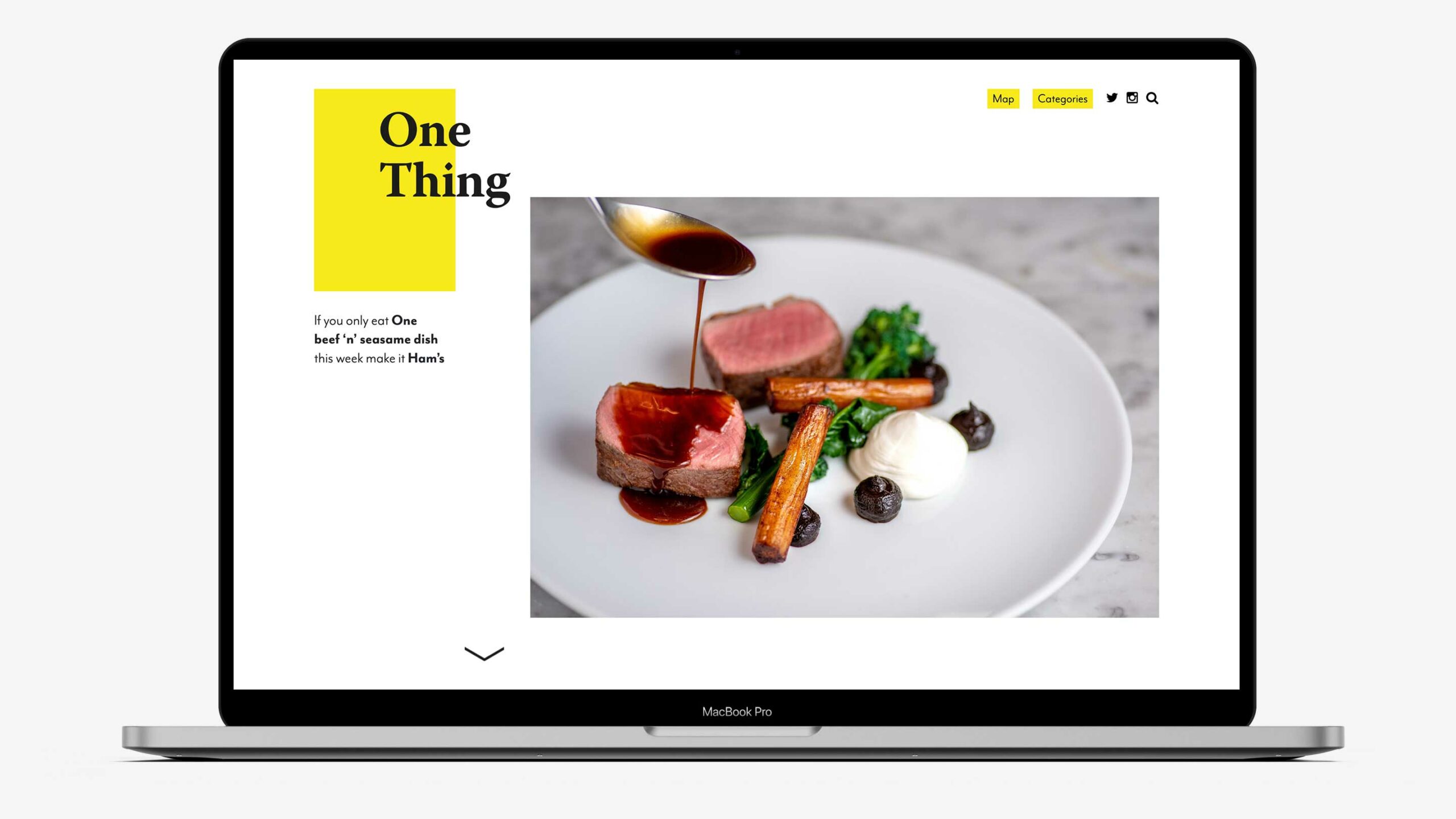
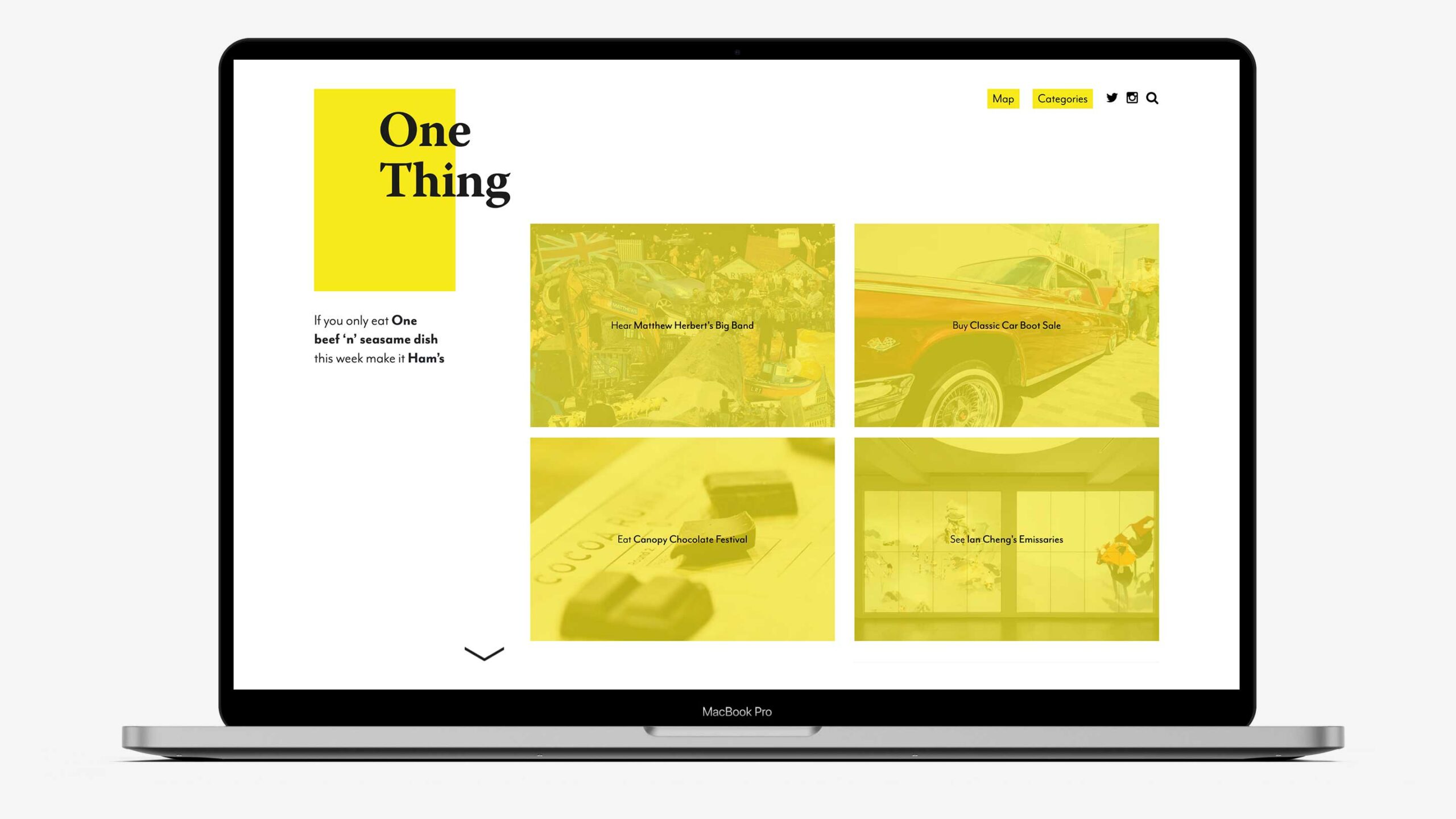
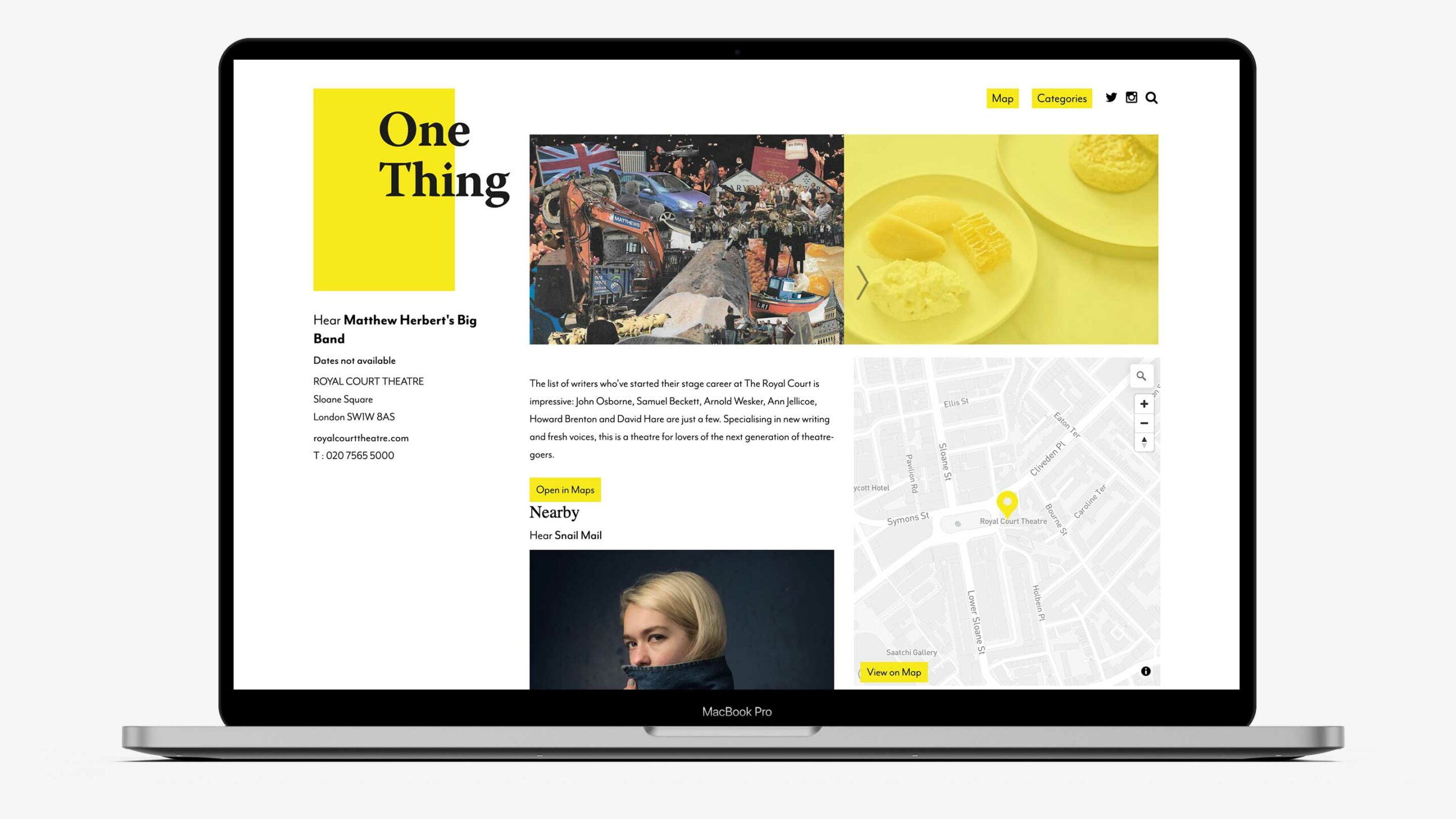
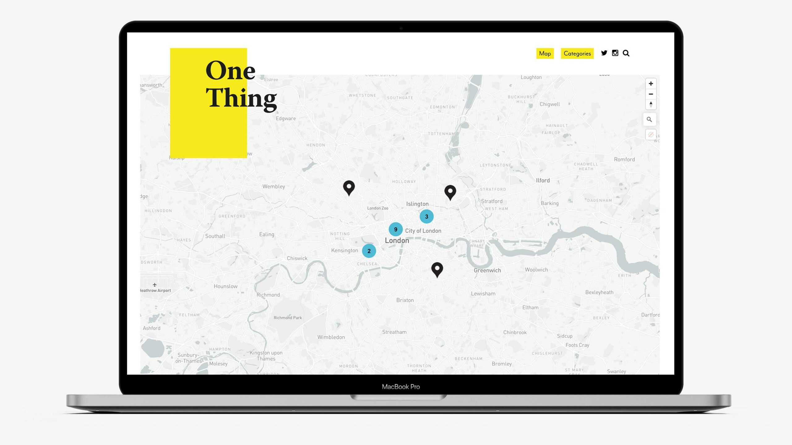
One Thing
Project
Independent review website
Industry
Media and hospitality
Category
Website Development
Task
They were excited to go live and in a hurry for a website that would provide things-to-do with linked locations.
Action
We wanted the look and feel to celebrate One Thing’s USP, so we created a minimal visual design that was stylish and simple to navigate.
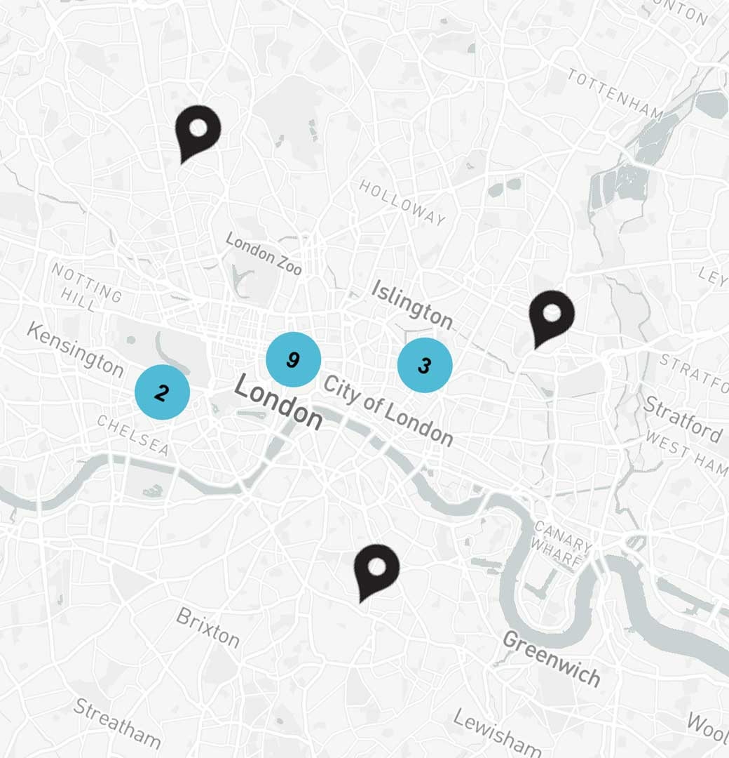
Time pressure meant we needed to be pragmatic with this website development project without compromising the site’s UX/UI design. By sourcing an alternative to Google Maps we were able to create an interactive location tool, linking curated content to the user’s chosen location.
Result
The team at One Thing were so happy with what we created that they’ve asked us to continue working with them – which is great as we loved this project!